In early 2022, Drizly decided to prioritize gift sending as a top use case for the platform, but the existing experience created a lot of friction and did not surprise or delight customers because it was not differentiated from the core on-demand experience.
Establish Drizly as the go-to platform for beverage & alcohol gifting by delivering a best-in-class gifting experience for senders + recipients.
Make Drizly a first choice for more shopping occasions; grow “non-core” (where core = 60-mins-or-less) orders to ⅓ of all gross bookings $.
I led design on the initative to redo the entire experience, from soup to nuts. This included the sender discovery and purchase execution all the way through the recipient receiving the gift. I coordinated with 4 consumer engineering squads, retailer operations, brand & marketing, and leadership to achieve overwhelmingly successful program enhancements.
Below is the TLDR version. To read the full story (and I mean the FULL thing, it's super long), click here.
Existing gift browse experience
When sending a gift on Drizly, the gift sender had to select an item for their recipient, but they might not know what that person likes to drink, or they might only have a limited idea (e.g. "my friend loves whiskey, but I don't - what's the difference between bourbon and rye?").
Once a sender has managed to pick out an item, there were a number of obstacles to actually completing the purchase. Sending a gift required knowing the recipient's exact address, email, and phone number. Oftentimes recipients weren't home to receive their gifts or didn't have ID; if they were able to get the delivery, it was often wrapped poorly.
With the instructions from on high to completely burn down the gifting program and rebuild it, there was a scramble for teams from all across the organization to start new projects. These projects often were coordinated with one another through Product and business needs, but not through the lens of the user. Making improvements to the overall experience would require these teams to all work in sync to prioritize the user flow from top to bottom.
Drizly is a dual-sided marketplace which connects shoppers with local liquor stores. In the US, the three tier system means that a business must be one of supplier, distributor, OR, retailer, but never more than one. Drizly technically exists outside of this system, merely facilitating purchases, but not actually executing them. As such, Drizly cannot ever hold money and cannot select a store for a user to shop from - they must always make that choice themselves. As a result, there are interesting design constraints as far as how we can direct the user to make the ideal choice.
There were a lot of ideas floating around about the problems with the existing gifting epxerience and what we could do to tackle them. Because gifting is such a complex initiative that touches consumer, retailer, and operations, there were a lot of different subject matter experts in the room. We needed to reach alignment on both the problems and the potential opportunities in order to decide on a roadmap.
I coordinated with our program manager to plan and lead a day-long onsite comprised of leadership from all over the org, including Product, Engineering, Retailer Operations, Brand, and others. We mapped the entire experience, layering in data and insights from everyone in the room, which helped us understand the gaps in the experience. This onsite laid the groundwork for all future gifting work and helped align high-level stakeholders.
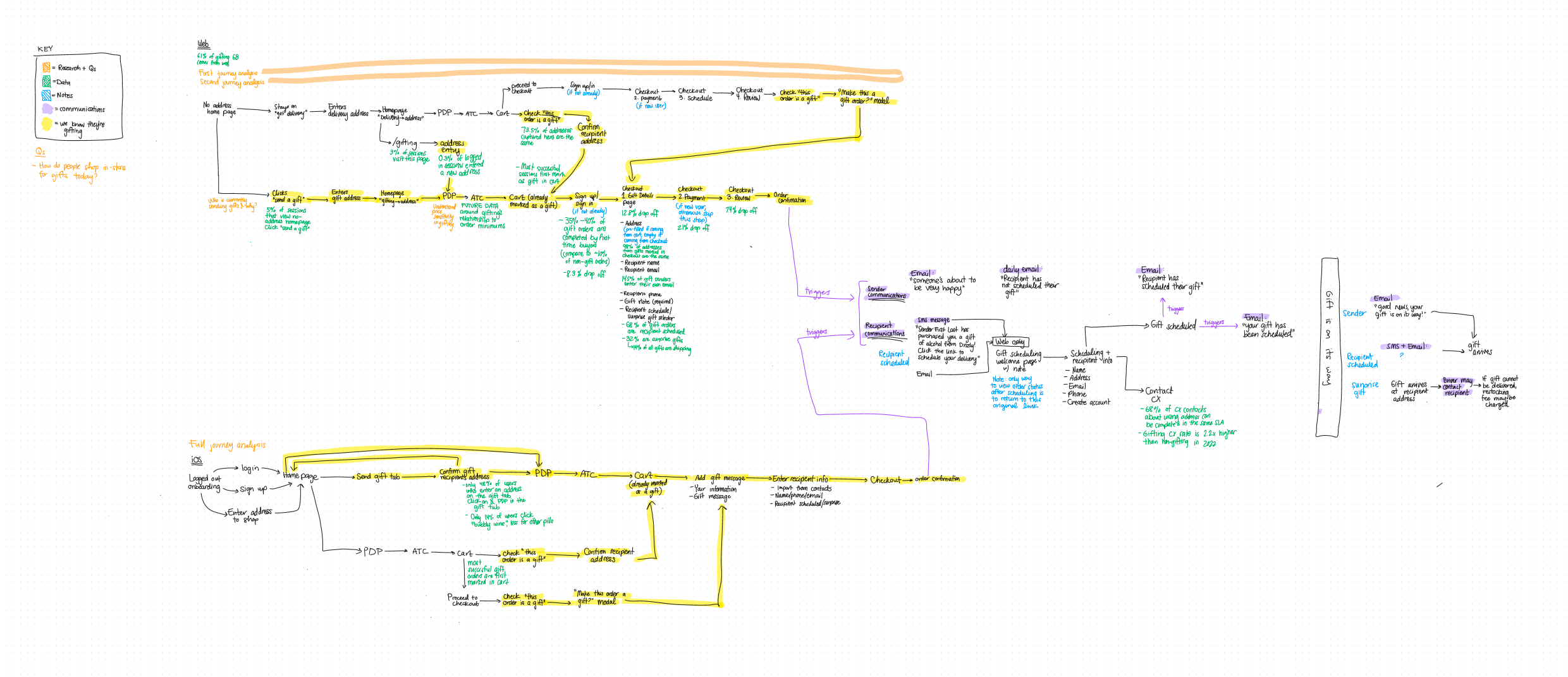
The entire gifting flow, from discovery though delivery, mapped in FigJam
After leaders across Drizly had a shared understanding of the problems in the existing gifting experience, I facilitated 3 brainstorm sessions with people from across the entire organization. Where the onsite was comprised of members of leadership, these brainstorms served as a way for the boots-on-the-ground team members who deal with gifting every day to share their perspectives. The ideas generated in these brainstorms and the subsequent affinity mapping of opportunity areas became the concepts around which we prioritized and designed.
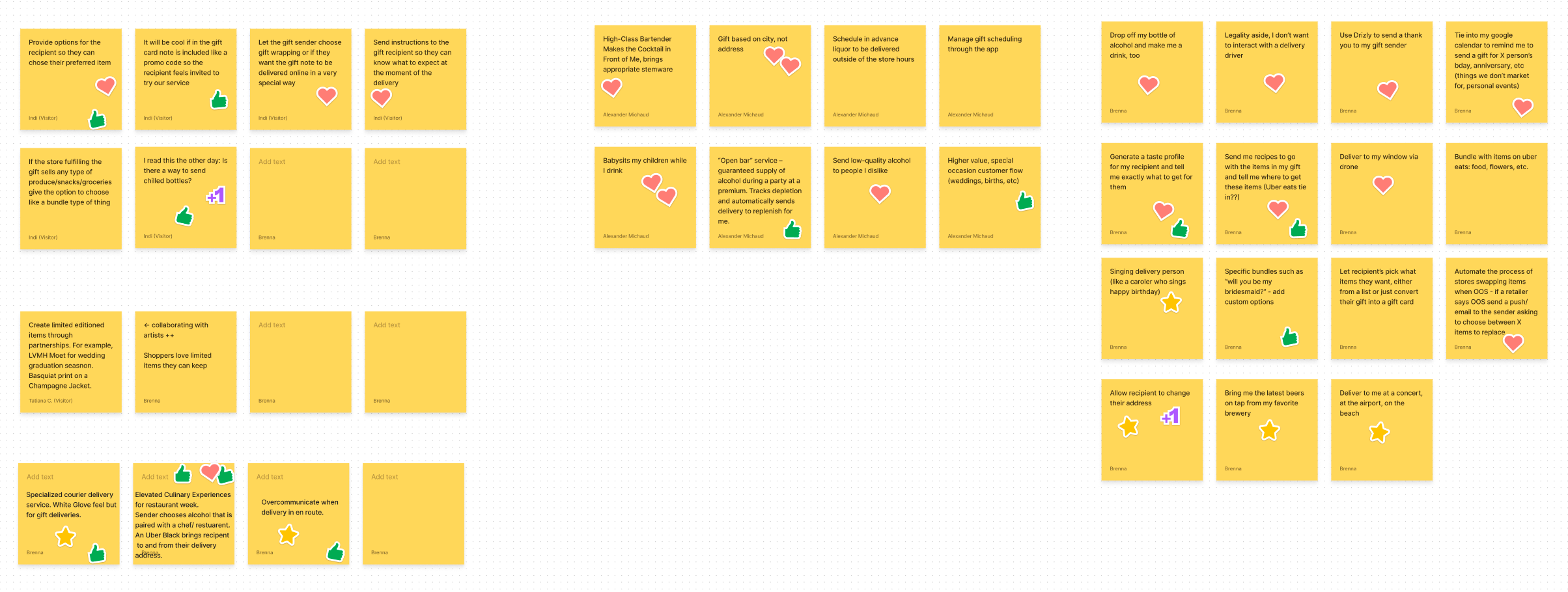
A sample of some ideas generated during the brainstorm
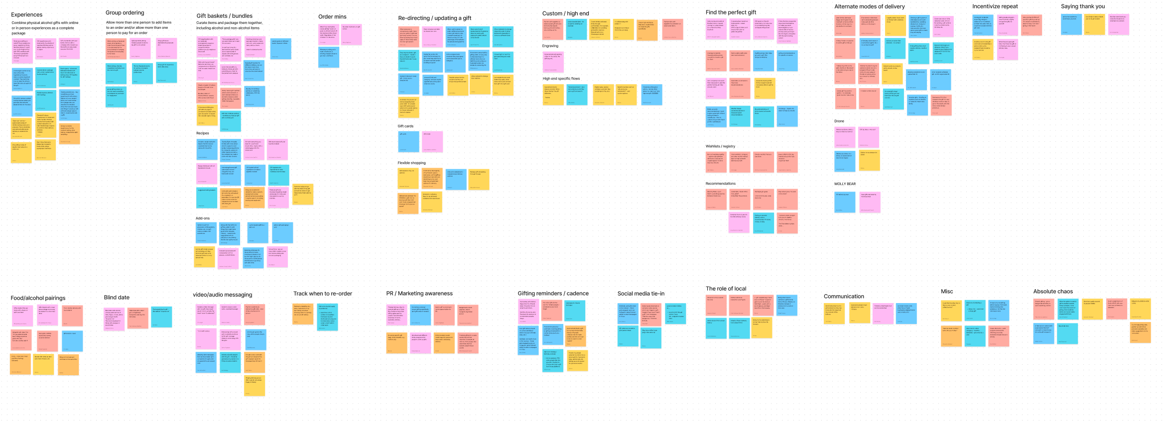
Affinity mapping of the ideas into opportunity areas
Though many opportunities were identified, we needed to make sure we weren't putting all our eggs in one basket or biting off more than we could chew. In order to actually make headway on improving gifting, we needed to prioritize. For my part, I see it as my role (roll*) to always be the voice of the user. I collaborated with my counterparts to understand the business and operations implications, but I always kept as my North Star the experience that the gift user would have throughout.
We conducted a number of user research studies to examine the sender & recipient experiences, learn from our customer service team in-depth, and even observe how users shop in store, not on Drizly. I conducted a competitor / comparator analysis to understand what features of our competitors were appealing and that we should consider adopting.
While the discovery part of the experience is delightful, and helping people find the right gifts is definitely useful, ultimately if the user can't successfully checkout and execute their gift purchase, none of the discovery portion matters. Based on that and conversations with the product team, we decided to prioritize the functional pieces of the experience before adding exploratory features.
Of gift senders enter their own email address
Drop off at gift details step of checkout
How much higher the contact rate is for gifts
Shoppers were confusing their own information with the recipient's, partially due to poor hierarchy and layout and also partially because many gift senders do not know their friend's/family's email address - just their phone number.
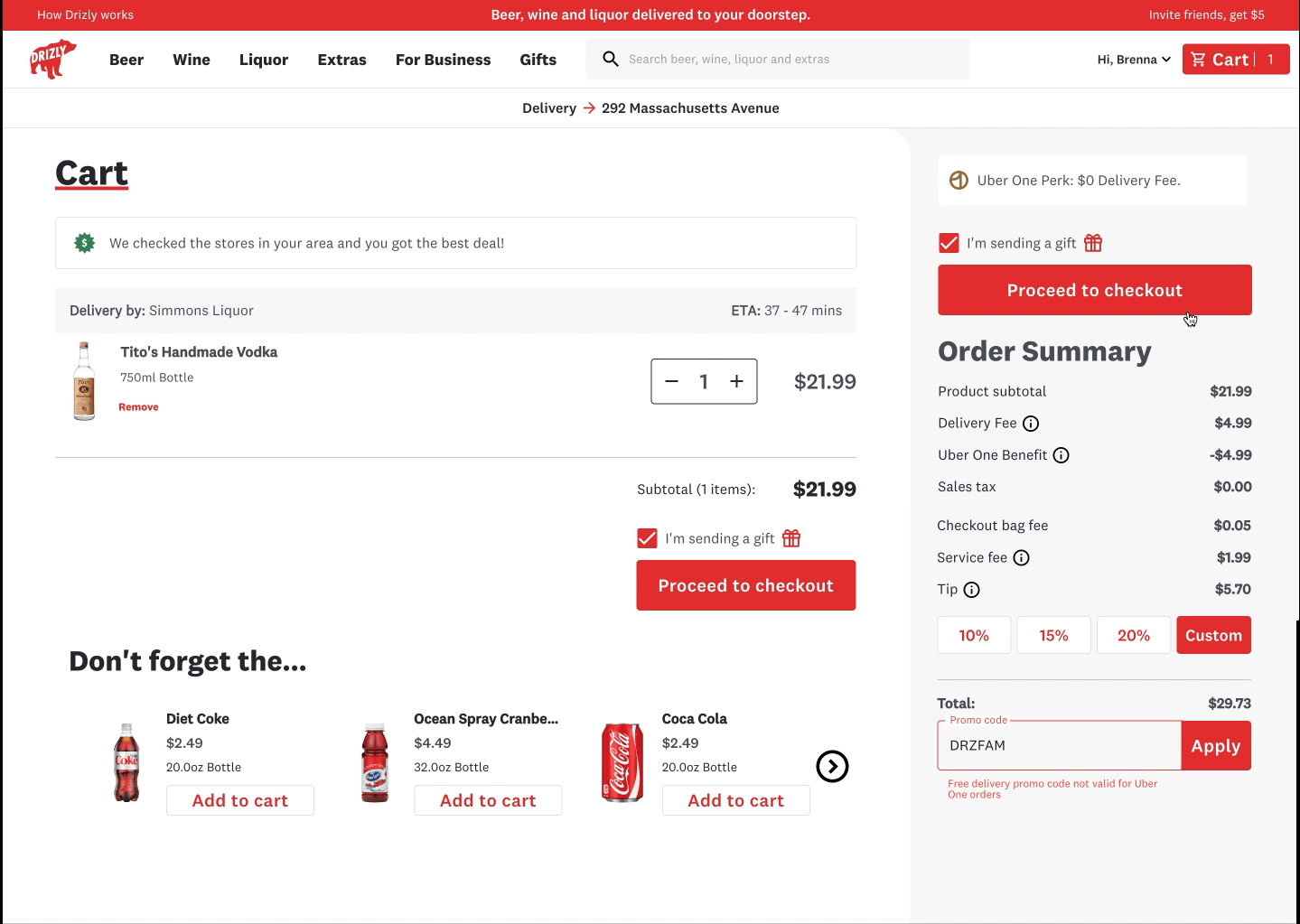
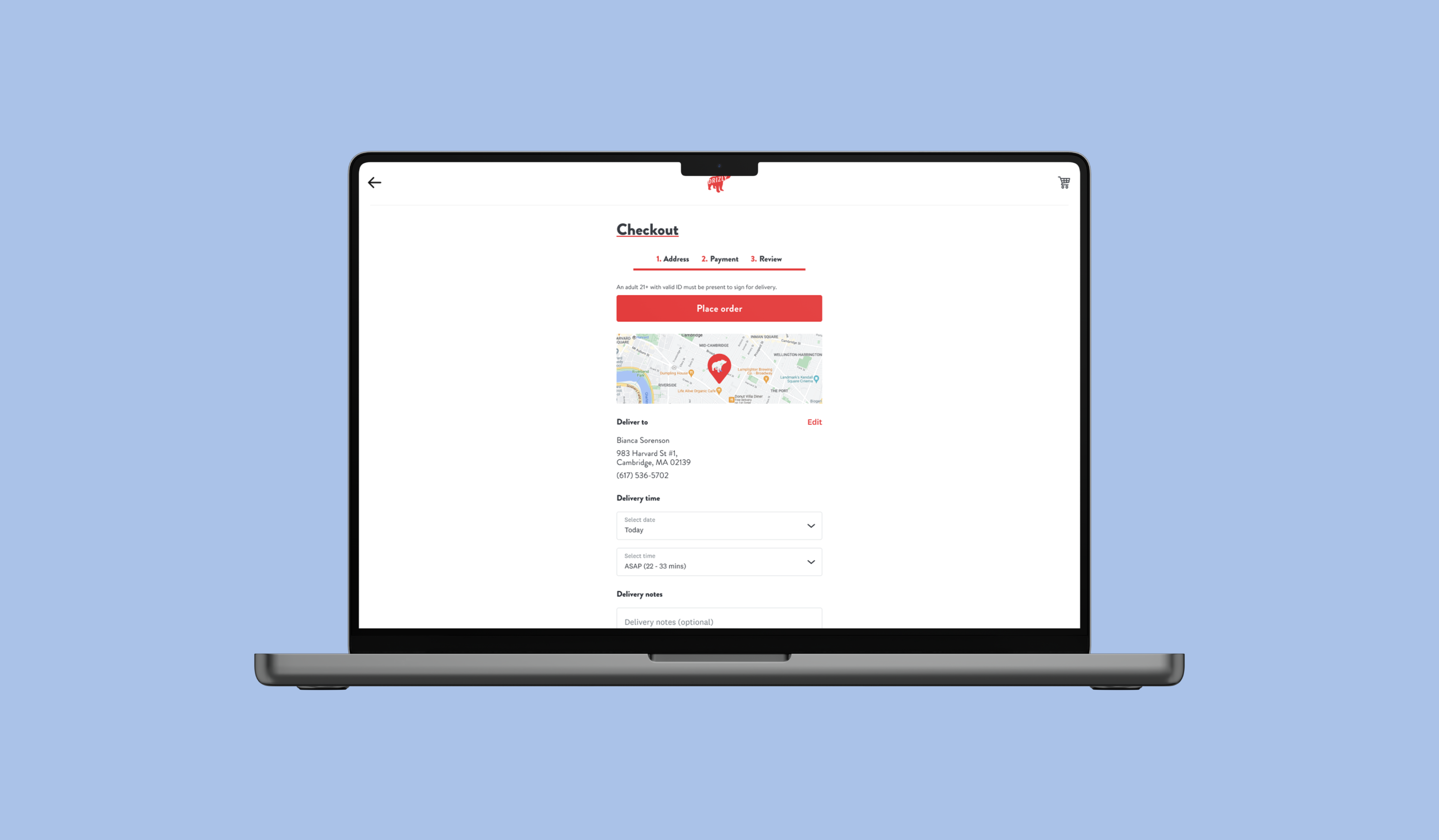
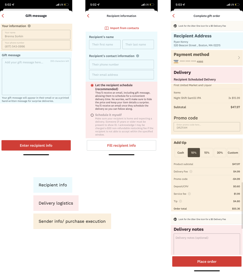
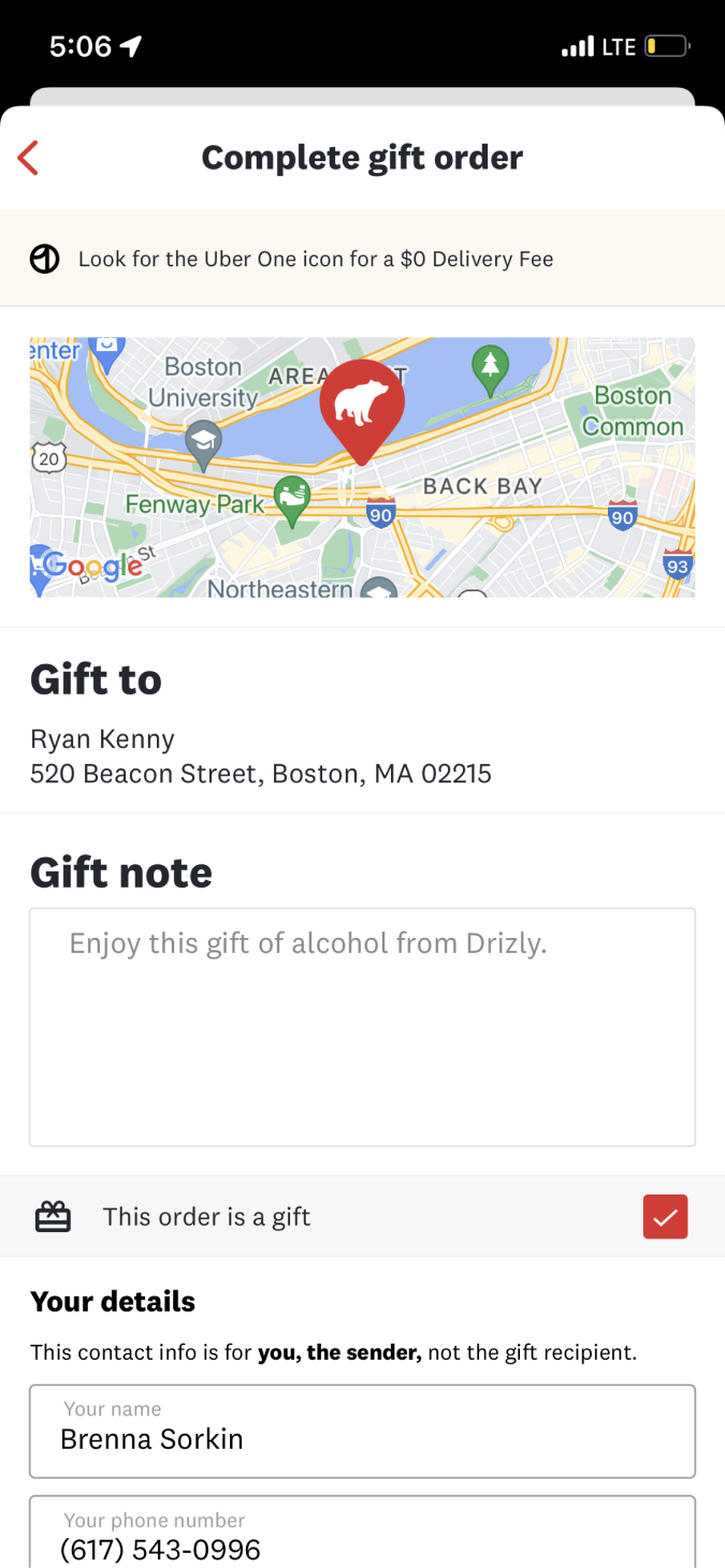
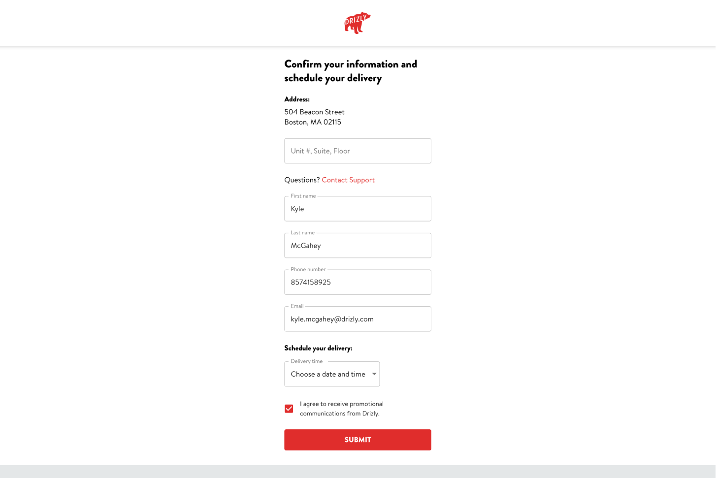
New gift sender checkout on web
Where before, information was mixed together between sender and recipient without any clear deliniation or explanation of next steps, now it is separated into clear sections with copy reinforcing the process. We moved to a more "single page checkout" experience, which allows users to enter and review information all in one place.
On iOS, we kept a multi-step approach due to technical constraints, but we regrouped the information to allow for more consise navigation through the process.
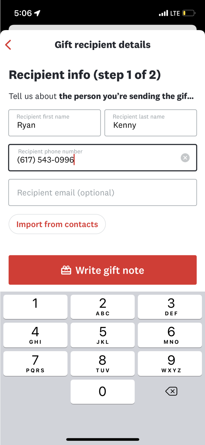
New step 1 on iOS - recipient info
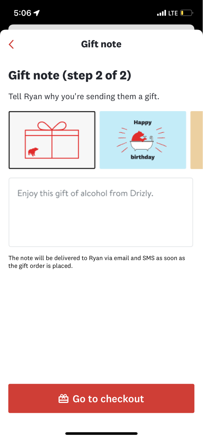
New step 2 on iOS - card & note
New review step on iOS
As part of streamlining the experience, we made recipient email address an optional field and also removed the option to make a gift a surprise, thereby significantly reducing the chance of the recipient not being home to get their gift.
Prior to this work, shoppers in search of a gift had to browse the same way as non-gift shoppers: by slogging through literally thousands of available products. While we can debate the merits of this for any user, for gifters this was particularly a problem since they are not shopping for themselves and are often operating on only a limited idea of what their recipient would enjoy.
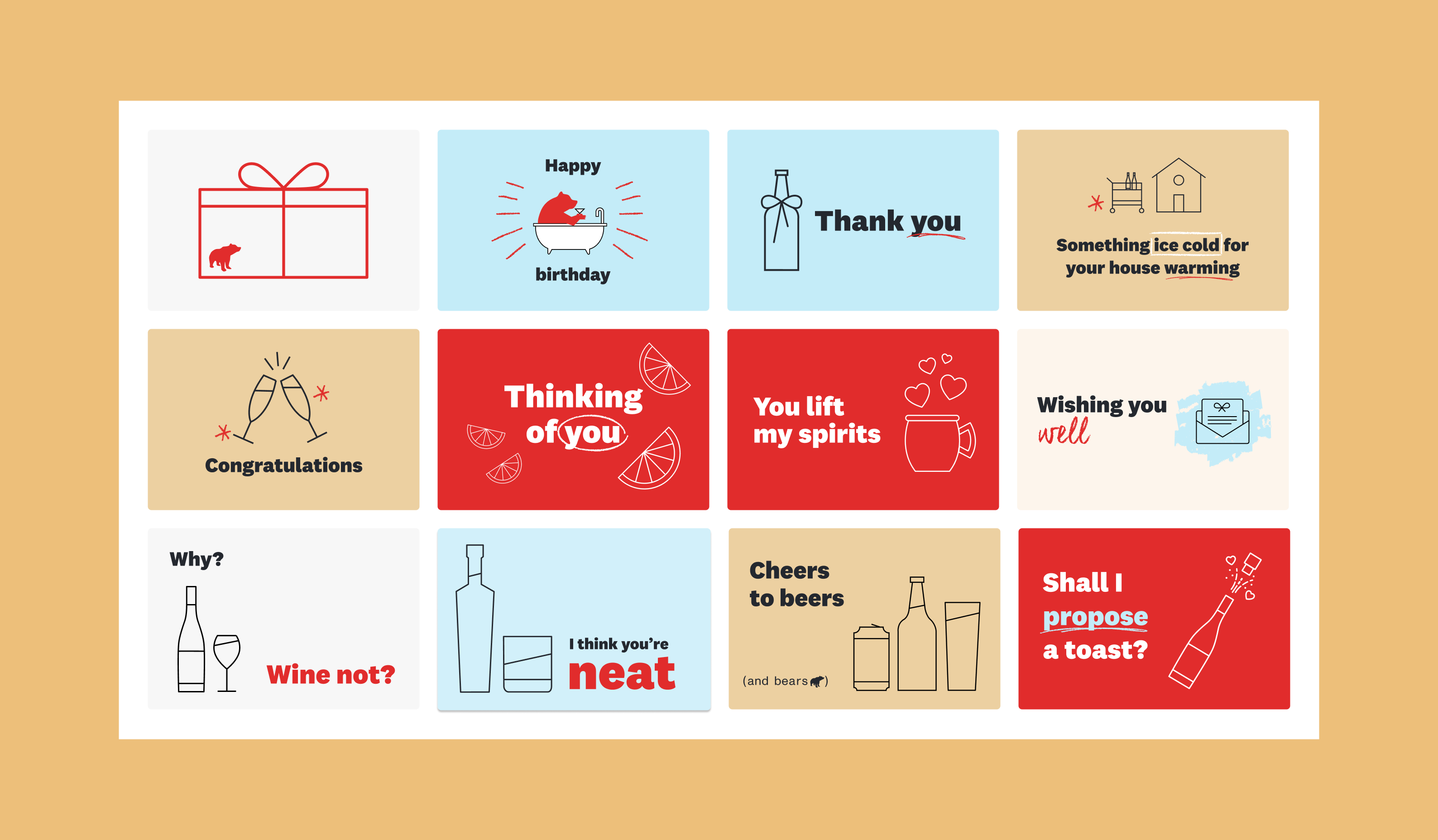
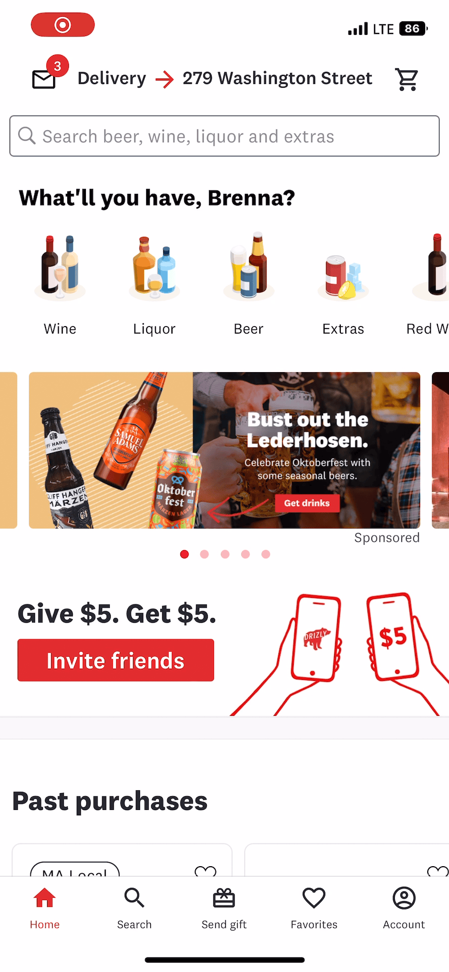
We created solutions for both shoppers who need just a little guidance and those who need complete hand-holding throughout the process. For independent shoppers, we needed to create a strong "gifting home" - a hub where they could go for gifting-specific products and guidance.
Gifting tab on iOS
Gifting hub on web
We created a space on web and apps that felt differentiated from the regular, on-demand shopping experience, and we directed shoppers to it as soon as they indicated an interest in gifting (on web, this meant redirecting them from the address capture page).
Here, tailroed products are surfaced and organized by occasion, rather than product category, which research showed is how our gifters tend to think. If a user shops by occasion, the relevant card selection will carry through to checkout, maintaining a coherent thread throughout the experience.
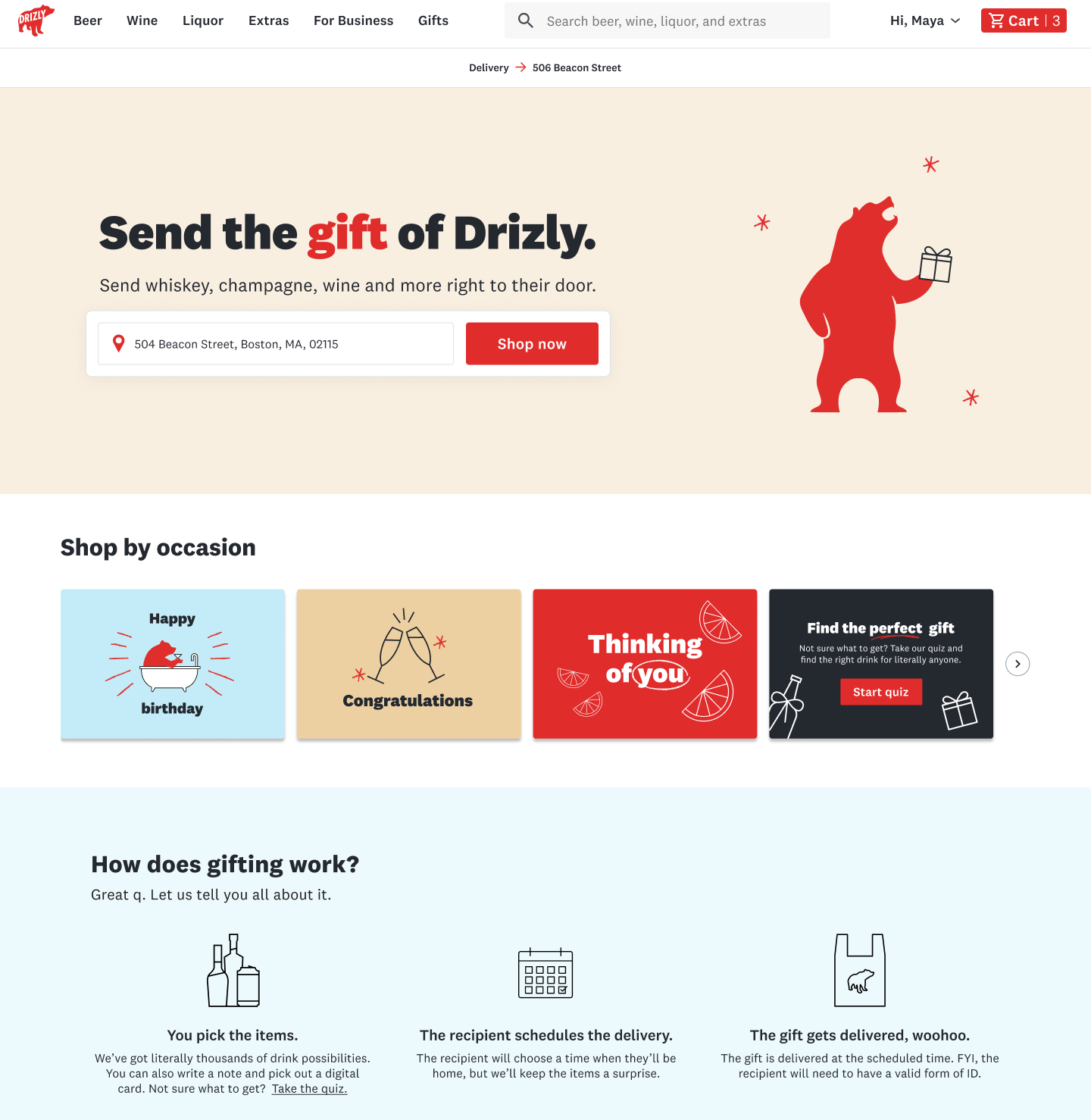
For shoppers who needed more help finding a product, we designed a guided gift quiz, which allowed us to recommend specific products and gave us space to highlight some fun brand moments.
Gifting quiz
Choosing the right product is only half the battle, however. Due to legal contraints, we cannot choose a store for the user, despite the fact that we know some stores perform better when it comes to gifting than others.
What we can do is provide affordances to help direct users to select the store that will ultimately provide the best gifting delivery. The "great gifter" badge also encourages our retailers to perform better on these key metrics, so they don't miss out on gift shoppers.
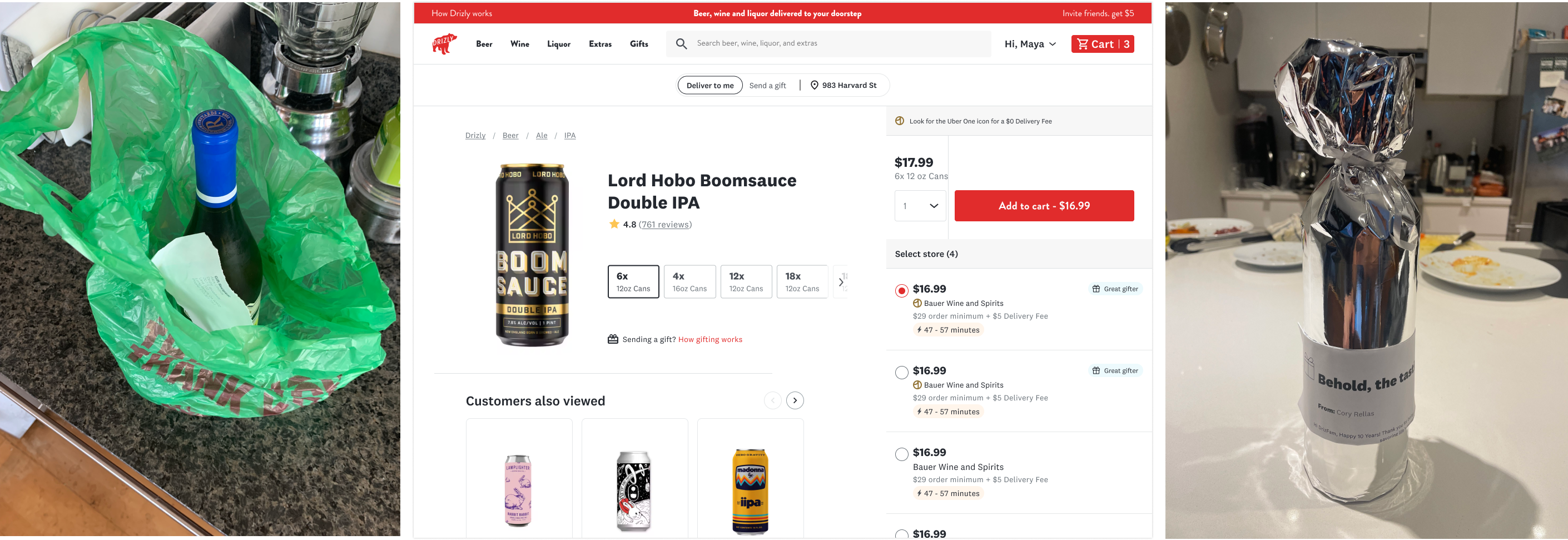
Badging good gift stores helps users pick a store that will deliver successfully
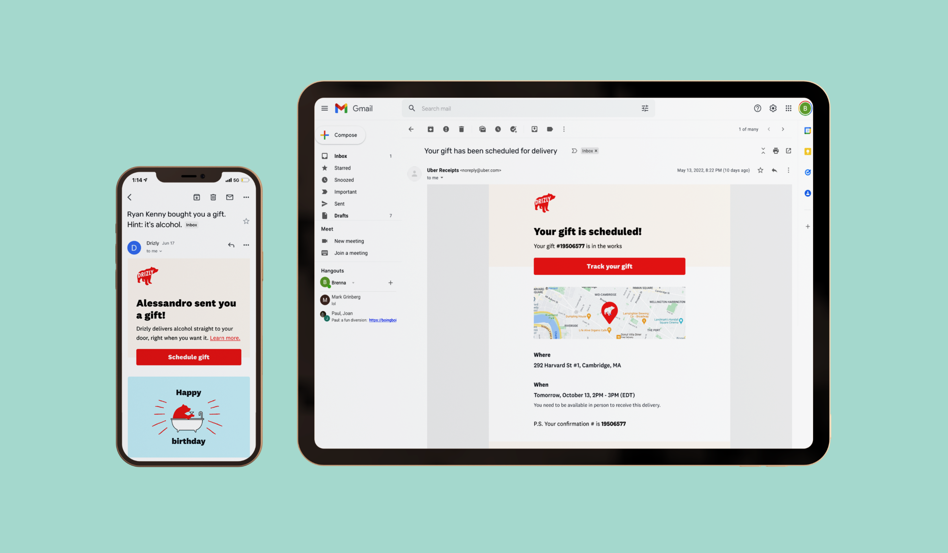
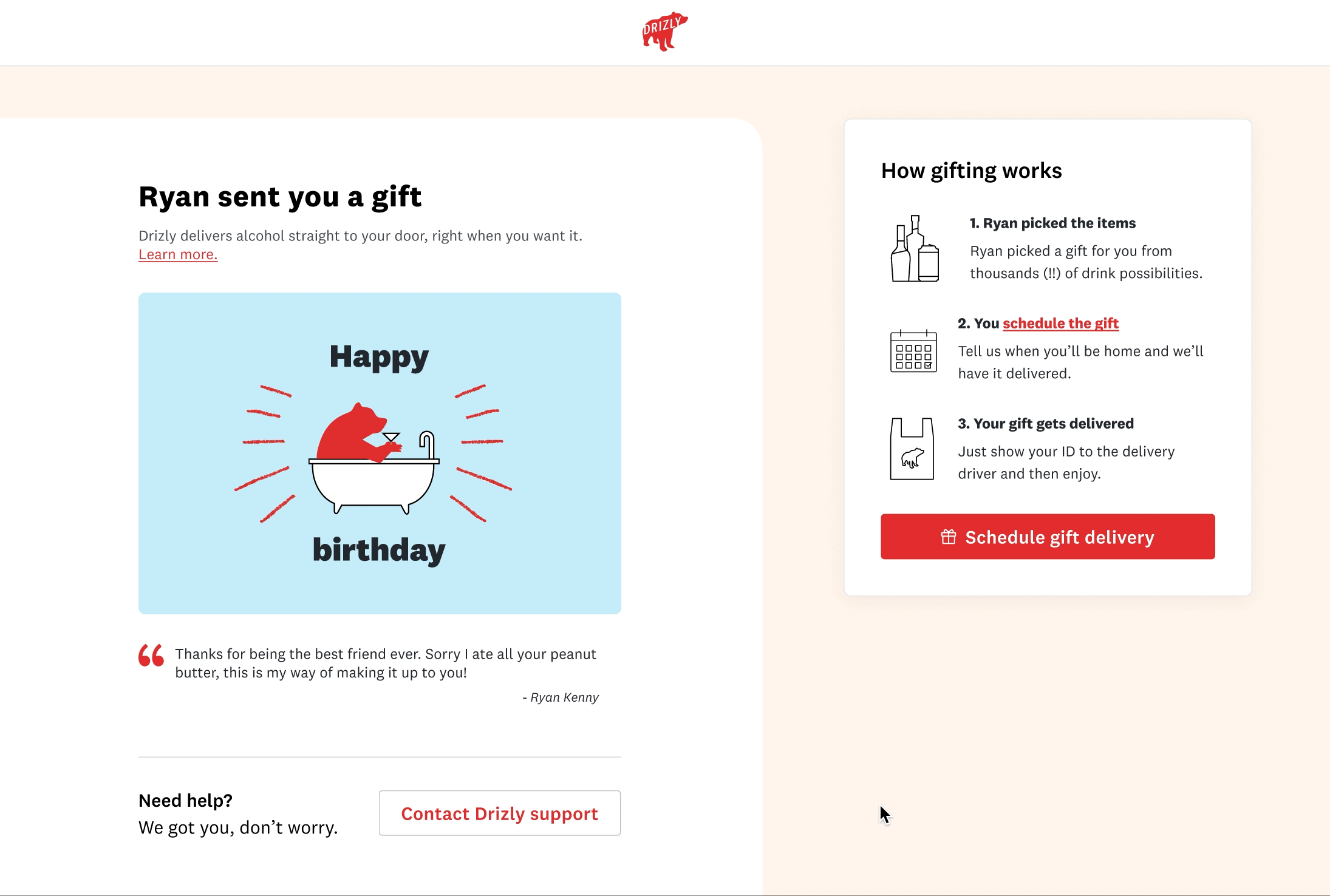
While removing surprise gifting eliminated some issues with recipient not home, poor recipient experience was still contributing to dissatisfaction and unsuccessful gifts. A large part of the issue was due to communication of expectations, namely that recipients must be home at the time of delivery and that they will need to show ID.
The easiest thing to tackle right off the bat was our transactional email communications - that is, non-marketing emails related to product actions.
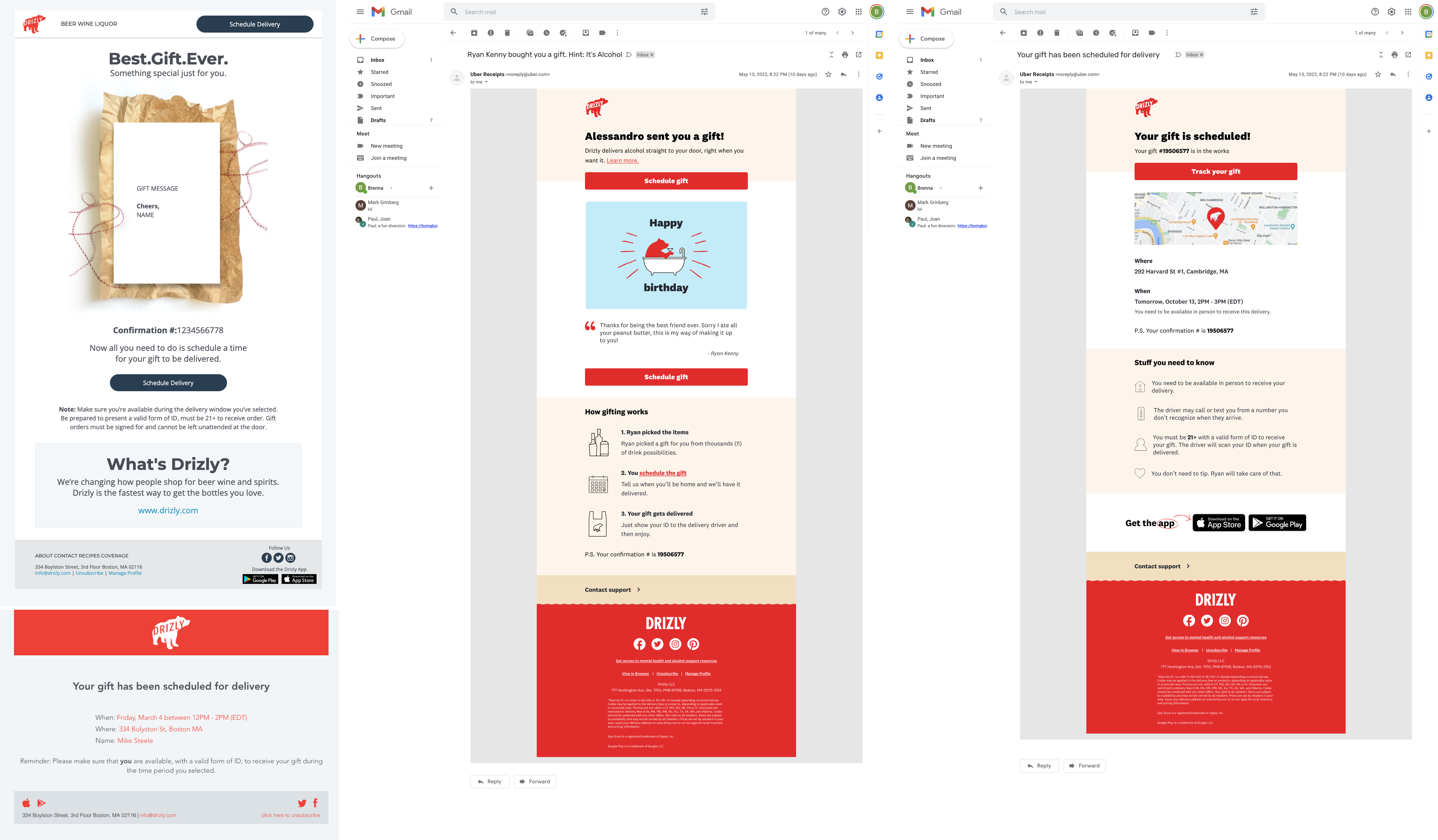
Old & new recipient transactional emails
The new emails were designed to provide a stop-gap, where recipients would clearly understand the next steps, even if the actual scheduling experience was still a bit clunky. Unfortunately, building these emails proved to be more complex than anticipated, so they will be launching with the rest of the recipient scheduling experience.
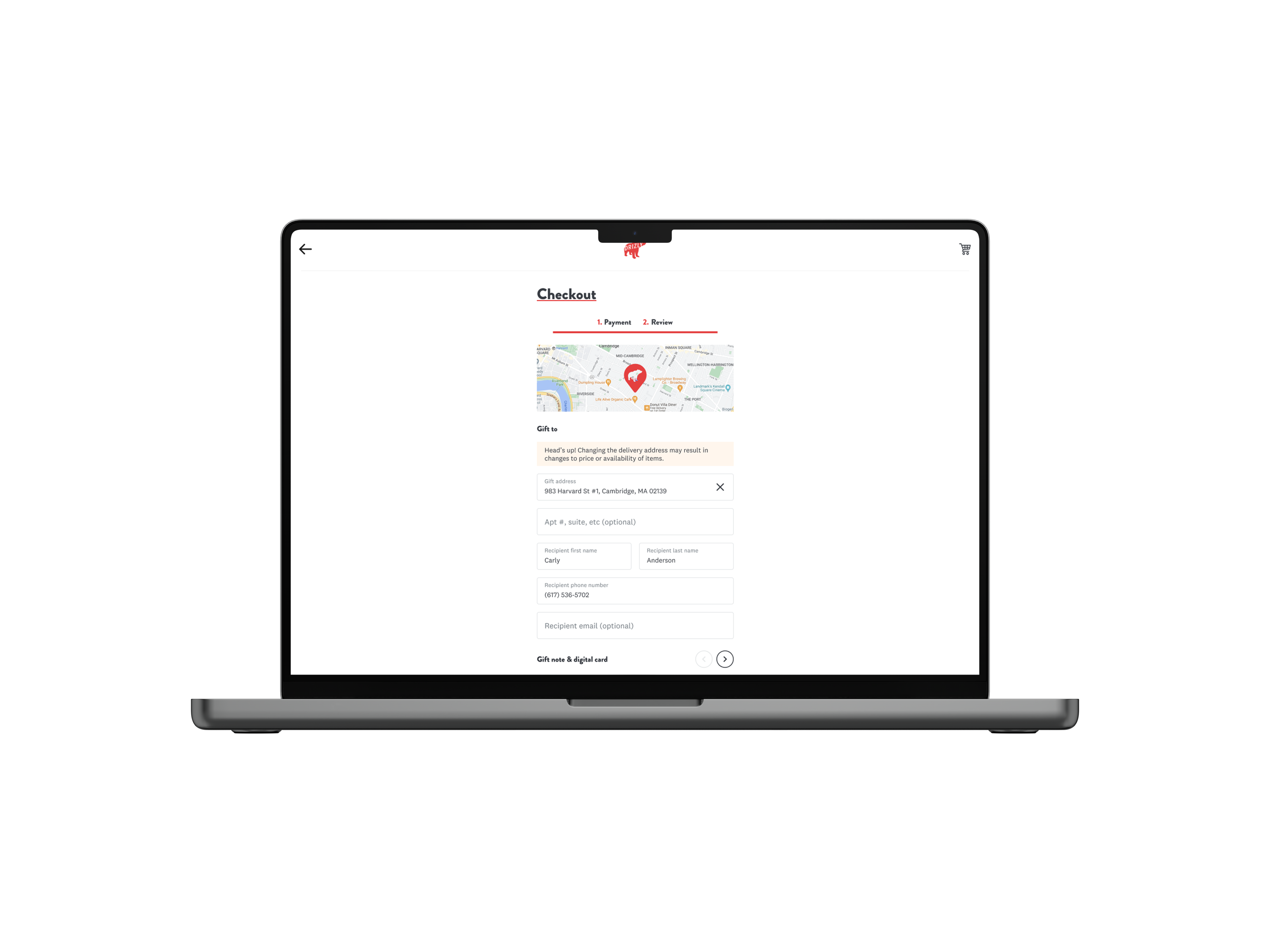
Old gifting experience
New gifting flow
We transformed what was previously a single page form with no context into a clearly laid out experience with key information appropriately highlighted. We also brought in the digital card that the sender chooses to increase the personalized feel.
We also added functionality to allow gift recipients to change their address if the sender messed it up slightly. If the address is too far away to be delivered by the same store we have to void it, but we found that 68% of wrong address issues can be resolved by the same store, meaning the address was close, just not quite right. Each CX contact costs Drizly over $1, so being able to manually adjust these addresses is a big win. (For context - a 5% reduction in contact rate saves Drizly nearly $10,000).
By revamping the foundational checkout piece of the experience we were able to convert more users who were already quite far along in the funnel, but had been boucing due to friction.
Reduction in drop off at gift details step
Reduction in void rate from no surprise gifting
Higher recipient shop-rate if they receive a card
By revamping the foundational checkout piece of the experience we were able to convert more users who were already quite far along in the funnel, but had been boucing due to friction.
Average spend increase through gifting hub
Increase in conversion for gift senders
V1 guided gift quiz completion rate (V2 in progress)

This is a potential flow through the entire gifting process, top to bottom.
When this initiatve launched, there wasn't consensus across the funnel on the consumer side, let alone across the whole organization, which needed to work together to see gifting from 50,000 ft. By leading cross-discipline brainstorms and workshops, folks became aware of what was happening in other parts of the company and were able to coordinate with the relevant people to achieve symbiosis on particular areas of the program.
By having design as the central voice in the initiative, I was able to keep a vision of the entire user flow from top to bottom and ensure that the shopper experience was coheisve across these many different facets.