Toast decided to overhaul all of the point of sale (POS) experience to a new design system, known as POS 3.0. The end of day experience for managers was particularly clunky and time consuming, resulting in users wasting time on unnecessary tasks and ultimately being confused.
Reduce time on task for managers closing their restaurant at the end of the night.
Increase task completion for individual close out tasks, such as closing open checks and clocking out employees.
I led design to bring the existing end of day experience into POS 3.0 styles and solved for major pain points. I coordinated with multiple teams and designers whose work interacts with end of day, ultimately creating a new experience that saves managers time and allows them to accomplish the tasks necessary to close the restaurant at the end of the night.
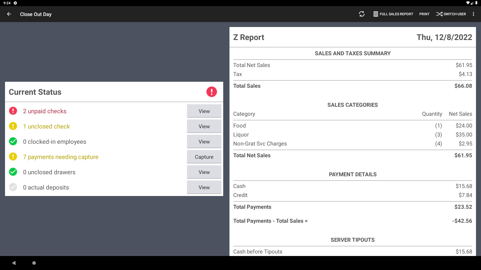
Existing POS end of day experience
The existing experience uses too much yellow/red and warning icons, making the user feel they've done something wrong even when they've just opened the page for the first time.
Restaurants have individual ways of operating, so not every task will apply to every restaurant, but the current experience does not allow for flexibiltiy and restaurants are not able to customize the experience as they need.
The close out day experience pulls together actions from all different parts of the POS. Completing tasks requires users to go off into other screens and then be routed back to close out day, which can be a disjointed experience.
The visual UI needed to be updated to "POS 3.0" styling to make it more consistent with the rest of the experience.
There wasn't a clear understanding of how managers were using the end of day experience in their restaurants, especially across different service models (cafe/bakery, full service restaurant, bar, etc.). I staged (fancy word for shadow in a restaurant!) at a number of places, often staying until 2 am to observe close out procedures and ask GMs questions.
I shared my findings with my product manager and engineering team to ensure that everyone understood the problems our users were facing at the end of the night.
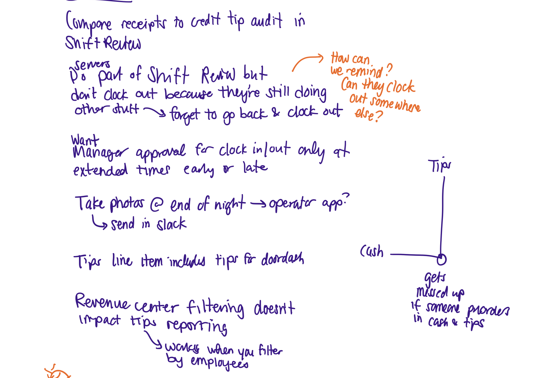
Some notes from my observations at The Lexington in Cambridge, MA
I mapped the dependencies within the end of day experience. I met with each of the designers on the teams who's work connects to end of day, creating a bi-weekly "end of day-ers unite!" meeting to maintain alignment and share ideas. We discussed opportunities for the close out day experience to connect with time entries (when employees clock in and out), reporting, our mobile app, and more.
I began exploring a few different concepts in Figma, centered around the idea of making it clear what tasks remain incomplete, and what steps should be taken to complete them. I prioritized information density and experimented with different tag colors and styling to help managers understand the state of their restaurant at a glance.
An early draft of the end of day experience
I started with a modular approach, thinking of close out day like a dashboard. My hypothesis was that a dashboard-style view would enable users to mentally chunk the information into digestible pieces and allow users to mentally categorize where to start.
I continued my restaurant visits and began showing these early drafts to operators to get their feedback. While users found the additional information and context useful for understanding the state of things, they informed me that they think of close out as a checklist, so a linear layout might be more intuitive.
A draft of a vertical view of close out day
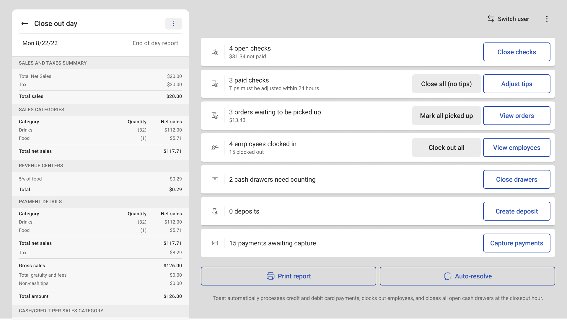
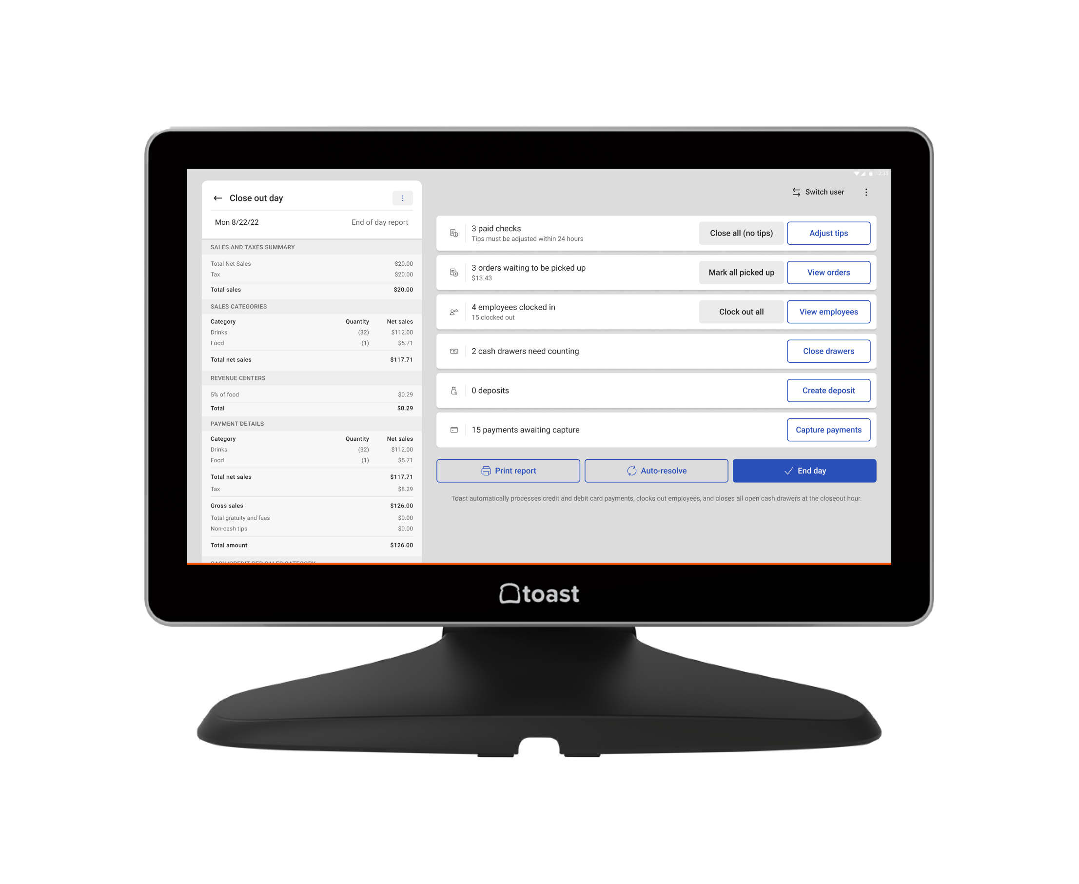
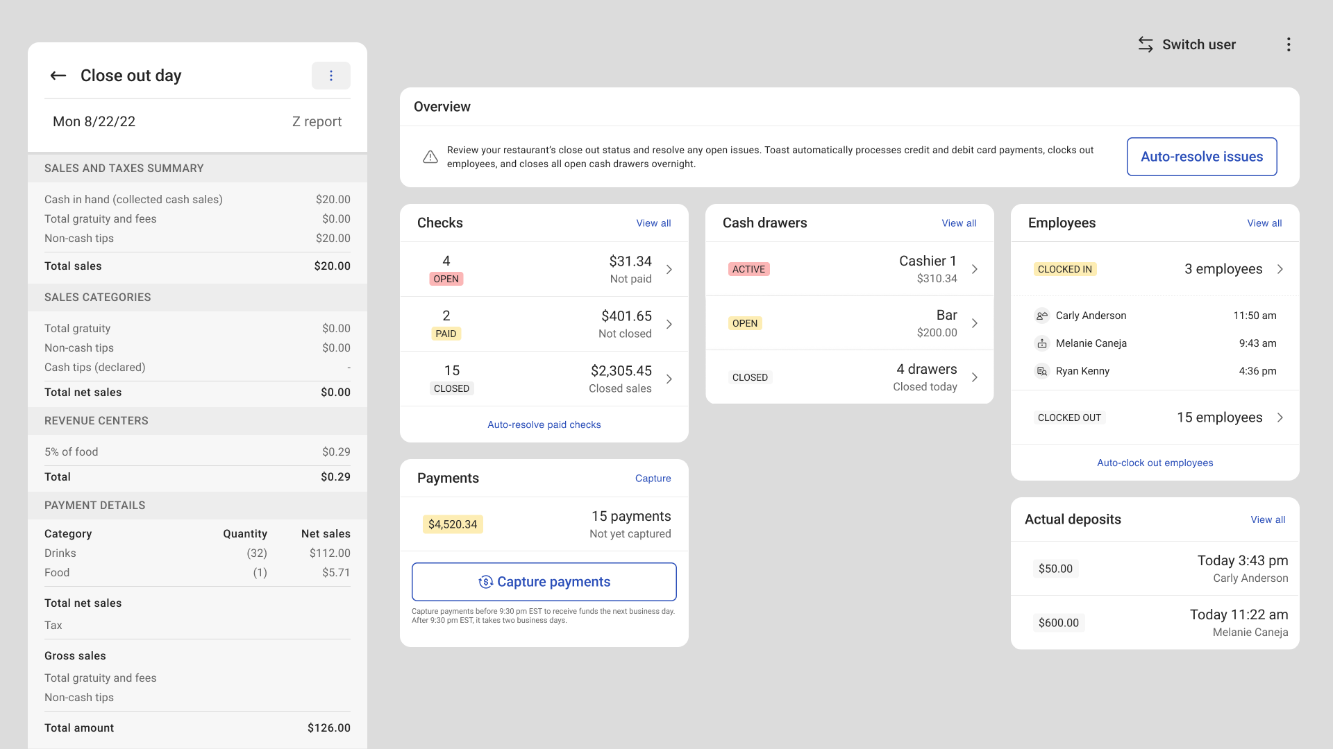
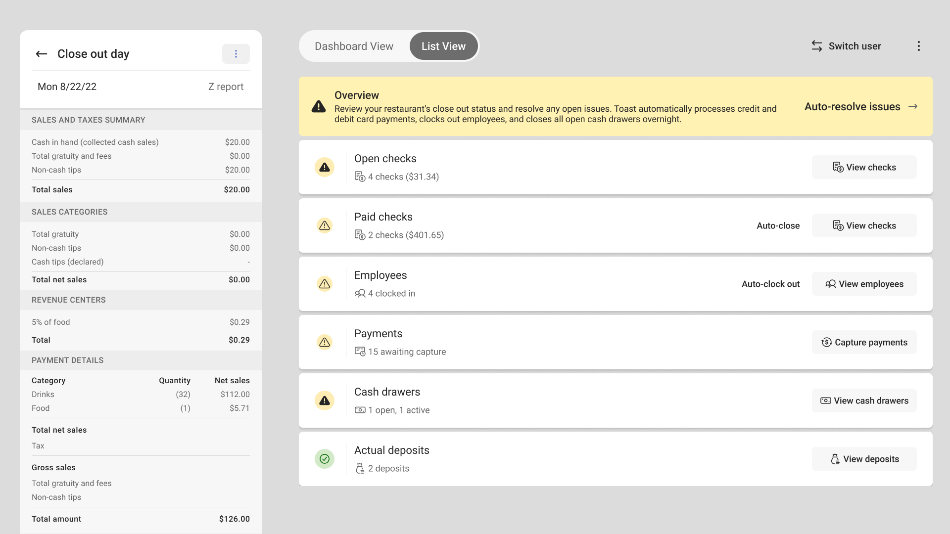
New end of day experience
I incorporated this feebdack, opting for a more vertical approach, but keeping the augmented information. I also explored different mechanisms for breaking apart the existing auto-resolve feature. Originally the feature clocked out all employees and closed all paid checks without adding a tip, but the combined functionality was intimidating and many users didn't even know about the feature.
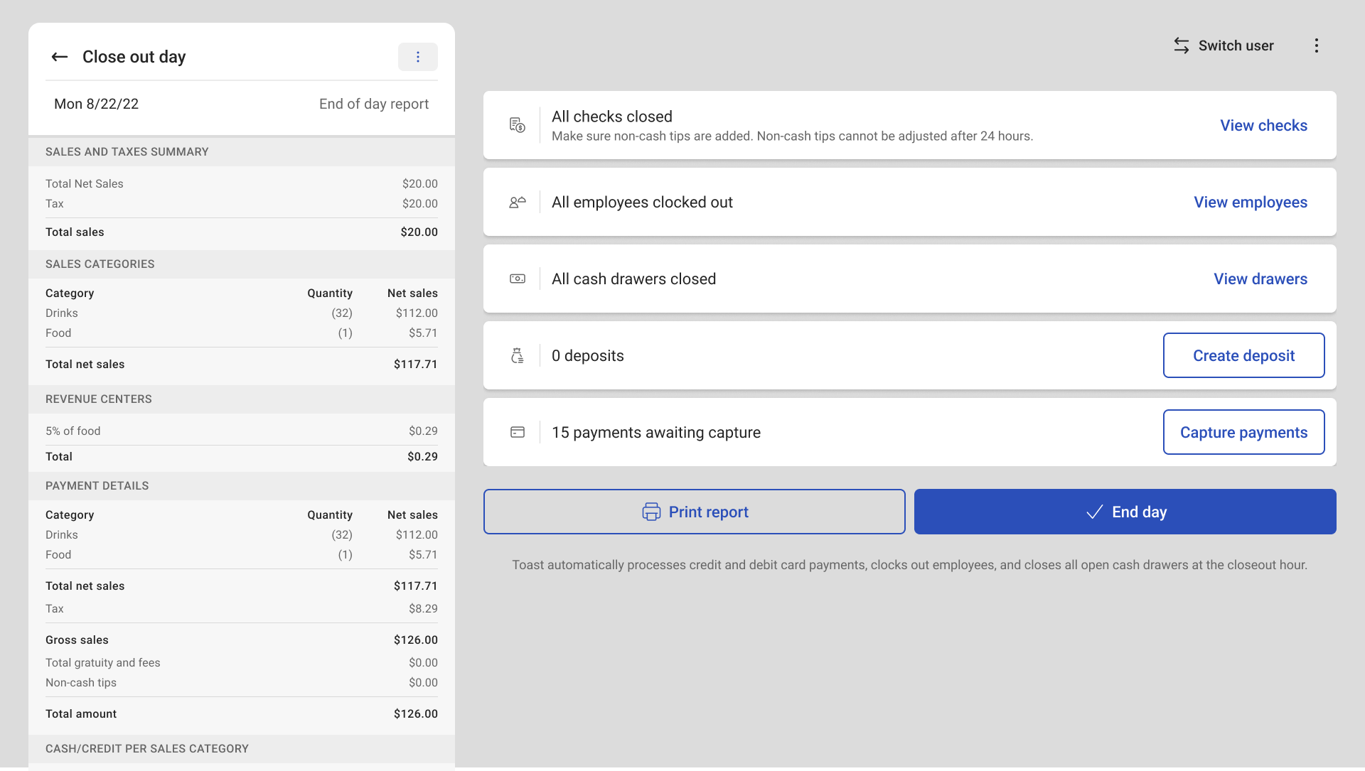
New end of day experience - completed
By redesigning the close out day experience we were able to save users time (allowing them to get home faster!) and help managers understand which tasks are most important and how to best resolve them.
Reduction in time on task
Increase in auto-resolve usage
Increase in deposit usage
Increase in rate of users clsoing the cash drawer
End day button usage (new feature!)
Decrease in capture payments (which is good)
At the beginning of this project, the brief was to simply to update the style of the screen to use the new POS 3.0 design system. However, I identified a number of paper cuts and greater problems and determined that this was an opportunity to improve the user experience beyond just the look and feel.
This project also exposed the interdependencies between different experiences within the Toast ecosystem. While these features are owned by different teams, from the user perspective they are deeply interconnected. This project kicked off closer collaboration between teams whose work impacts the end of day experience, laying the groundwork for a more cohesive experience.